


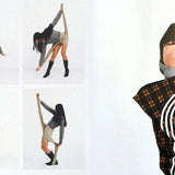





An unconventional brand. A storefront to match
A complete Shopify rebuild for NO/FAITH STUDIOS. Editorial imagery, distinctive navigation and product interactions developed to carry the brand’s point of view through the entire shopping experience.
The brief was the brand
NO/FAITH STUDIOS came to us to rebuild its entire website. The German fashion label had a clear visual language. Our job was to translate it into a Shopify experience with the same character, from the header to the cart.
Coordinates in the header. Condensed type beside monospaced details. Large imagery and deliberately restrained controls. We developed these elements as one system, so an unconventional design still feels coherent when people browse, select a size and buy.


A homepage with an editorial rhythm
Campaign motion sets the tone. Product galleries, category chapters and large editorial images keep the journey moving. We developed the homepage to let the brand’s world and its catalogue sit naturally together, with dedicated interactions for desktop and mobile.
The catalogue has its own language
The collection page carries the same typography, spacing and product-first layout. Image galleries live inside the product cards. Filters and viewing controls let people change how they explore the range while the visual identity stays consistent.


A product experience with a point of view
The product page keeps the visual restraint of the brand while giving each decision its own space. Explore the gallery, understand the fit and choose a size. The same thinking extends to quick buy from the collection.
Large product photography, a numbered image index and a quiet information column. The gallery gives the piece room, while size, material, care and shipping stay within reach. We developed the desktop and mobile layouts around the way each is browsed.


Model measurements and the worn size sit next to the size selection. A dedicated guide opens over the page, using the same type and fine rules as the rest of the site. Useful information, presented in the brand’s own language.


Quick buy opens the product from the grid, with its images, details and size selection in a side panel. People can get closer to a piece without losing the collection behind it. A custom interaction that belongs to the same design system.
The last step still feels like the brand
The cart follows the same visual rules: clear product information, restrained controls and recommendations that keep the catalogue in view. We developed it as part of the complete storefront, carrying the identity through to the handover to checkout.


One world. Every touchpoint
The campaign creates the world. The website gives people a way through it. Our role was to make the visual direction work as a complete shopping experience, with the details developed together across every template.
Your storefront should feel like your brand
We design and develop Shopify experiences around the businesses behind them. The identity, the product and the way people buy, built together.